
I don’t love social media, but the power of social networks cannot be underestimated.
Social network analysis can help us understand how people connect and how everything spread around the world, from ideas to diseases.
I could bore you with the details about social analysis and why it’s so cool, but instead, I’m going to tell you what I did for my own Twitter network.
My social accounts
This is what my main social media accounts look like:
| Social Media | Last Interaction | Followers |
|---|---|---|
| Deactivated account (years ago) | ? | |
| Reactivated last week - Made a retweet | 54 | |
| Reactivated last week - Made a comment | 522 | |
| Reactivated last week - Made a post | 2'378 |
With only one account above a thousand followers, I’m definitely not an influencer.
There’s however an advantage to having a small social following: it becomes very easy to analyze that network. So that’s what I did. I selected the social network where I’m the least active and started coding.
The experiment
The first step in my process was defining what I wanted to study. And that was my followers.
So I applied for the Twitter API, and a few e-mails later, I got “Elevated Access” to their API.
💡
You need “elevated access” to get information about the followers of any account, even if they are your own. While this is total bullshit, Twitter is probably the developer friendliest of them all.
The next step was to write some Python code to download my followers and then to download my followers’ followers. Doing all this while trying to respect their API limits, making the process simple, but painfully slow.
The follower map
After downloading the data, I cleaned it up a bit, converted it to a spreadsheet format, and imported it into Gephi, an open-source network analysis, and visualization tool.
After playing around with different layouts, this is the result!

A map of my Twitter followers. Network analysis does make for some pretty charts, doesn’t it?
Isn’t it beautiful?
Even though I’m not active on this social media, I was able to identify some interesting clusters:
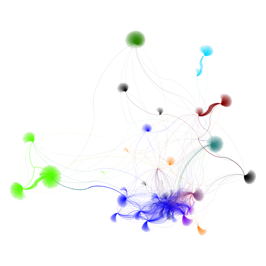
Network cluster analysis and respective colors
These are the semi-supervised clusters and their colors:
| Cluster | Color |
|---|---|
| Portuguese friends and colleagues | Dark Blue |
| NFTs (Ticklish, Scottwernerd, and Polys.art) | Lime |
| Jacques and his impressive network | Green |
| Enlightenment.ai - my company | Orange |
| International friends (Singapore, London, etc) | Purple |
| Trading and Investing - Grim and Kvark | Dark Red |
| Not really sure | Black |
| Hypnosis accounts (??) | Cyan |
Real Network Size
Turns out that even with just my 54 followers, this network of 1st and 2nd-degree followers is made of 11'129 nodes and 13'524 relationships.
This really shows the exponential power of social networks.
Part 2?
It could be interesting to make a Part 2 of this article.
Perhaps, I’ll study the limits of my network, and maybe even expand the study to third-degree connections (if Twitter allows me…).
In the meantime, feel free to follow me on Twitter or Instagram - you might show up on the next visualization :)
Definitely not on LinkedIn though, they make it so difficult to use their API, I doubt even the pope is able to access it.